CSS
CSS How to Add Shadow to Text?

In the article, we will take a look at the CSS for adding the shadow to the text.
For enhancing the design of the headings or any other part of a webpage, we can give the text various styles that will increase the readability experience of the user.
We can add a shadow to the text with the help of CSS which will help the design of the element to look very unique & eye-catching.
As the name conveys the Shadow effect is the shadow that will appear behind the text.
This Shadow can be given color whereas we can increase or decrease the depth of the shadow.
How to add shadow to text with CSS?
We use the CSS text-shadow property for adding a shadow to the text.
At the time of using this property, we have to provide 3 arguments separated by commas.
In the first parameter, we specify the horizontal shadow depth in pixels, in the second parameter we provide the vertical shadow in pixels and finally, we give the color to the shadow.
Let’s jump into the code section to have a better understanding :-
CSS :-
    h1 {
        text-shadow: 3px 3px orange;
    }
HTML :-
<h1>This Heading has a Shadow</h1>
Result :-

In the CSS section, we have given style to the h1 that specifies the text-shadow effect.
In the HTML section, we have created the HTML element that has some text.
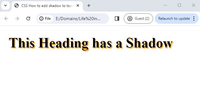
In the Resulting image, the h1 text can be seen with a shadow effect with an orange color.
Conclusion
We have learned the CSS to add the shadow to the elements on the web page.
We have explained the CSS property text-shadow that does the work of applying the shadow to the text.
Hope you have learned the code that you were in search for.
