In this blog post, we will look into “CSS header image” on a webpage & get into various ascpects relating to it.
How to add CSS centered header image?
Majority of Websites are filled with images from top to bottom. Images can be found in every section of the web page. There are primarily 3 sections within a web page named as header, content & footer.
Popular websites make the use of header images in an appropriate way & they design high quality images with lesser file size.
Displaying a header image enhances the first impression of the visitor because that is what hits the visitor’s eyes first. Header image appears right in front when the web site is opened.
Background image can be centered so that the image will look aligned & balanced. The image can be a complete banner that will occupy the full width or it can be a small image like a rounded logo.
We will now look at Practical example :-
CSS :-
    .header-image {
        background-image: url("smile.png");
        height: 300px;
        background-position: center;
        border: 2px solid blue;
    }
HTML :-
    <div class="header-image">
    </div>

    <p style="text-align: center;">Main Body Content</p>
Result :-
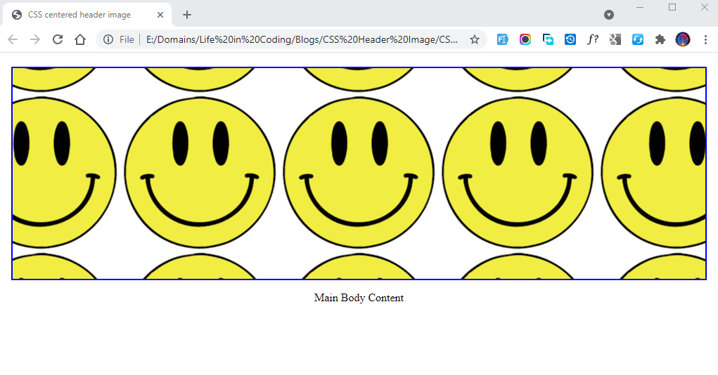
The CSS section in the above code defines the properties for the background image to be displayed.
background-image property accepts the url of the image to be displayed.
height is the second CSS property, we decide the height of the div container & as per the design of the website height can be adjusted.
background-position determines the alignment of the image within the div container. We are using center value to display the image in a centered position. The smile that we have used is a small size image & it is repeated consecutively as per the default nature of background-image property. We can stop the repeat & in the next following section we will learn to remove the repeat.
border is applied to the div to display border around the image & this property can either be used or it can be skipped as per the design requirement.
In the HTML section, we have the empty div element having the class header-image. This div is used as a container to display the header image. Following the div tag is the p element & it is just for representation of the further content below the header image.
How to add CSS header background image with no repeat?
As we can see in the previous example, the background image that we used is a small image with a smiling face that is repeating across the complete area of the container.
Background Image is repeating because of the default value of repeat for the background-repeat property. We can modify this property to erase the repeat effect.
By using no-repeat the background image will appear only once & as per the background position it will be displayed in the container div.
We will look into the actual display of the image :-
CSS :-
    .header-image {
        background-position: no-repeat;
    }
Result :-
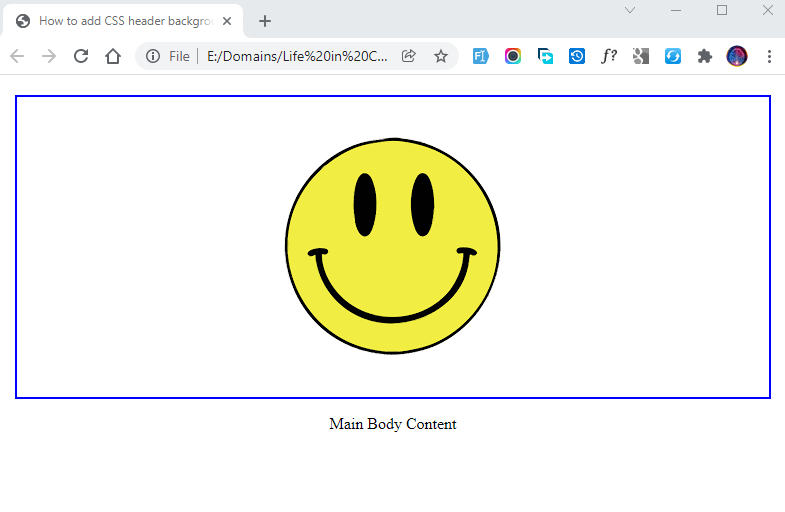
Background-repeat property
Background-repeat property provides different options. We will take a look at the various other values.
Background-repeat: repeat-x
CSS :-
    .header-image {
        background-position: repeat-x;
    }
Result :-
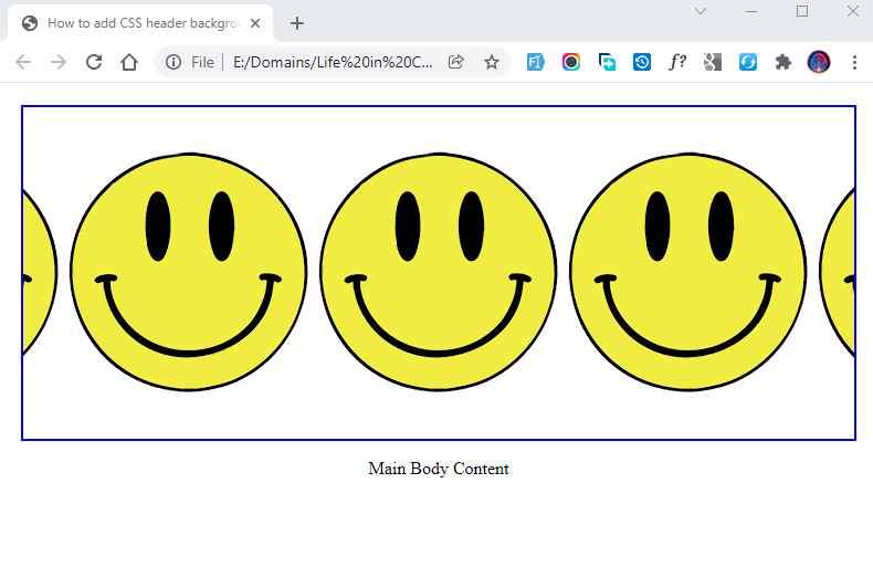
Applying this value will display the image horizontally across the container. As you can see in the above image, the smiling picture is displaying one after another in a horizontal pattern.
There are no repeats in the vertical or any other section of the container. The image just repeats in horizontal alignment.
Background-repeat: repeat-y
CSS :-
    .header-image {
        background-position: repeat-y;
    }
Result :-
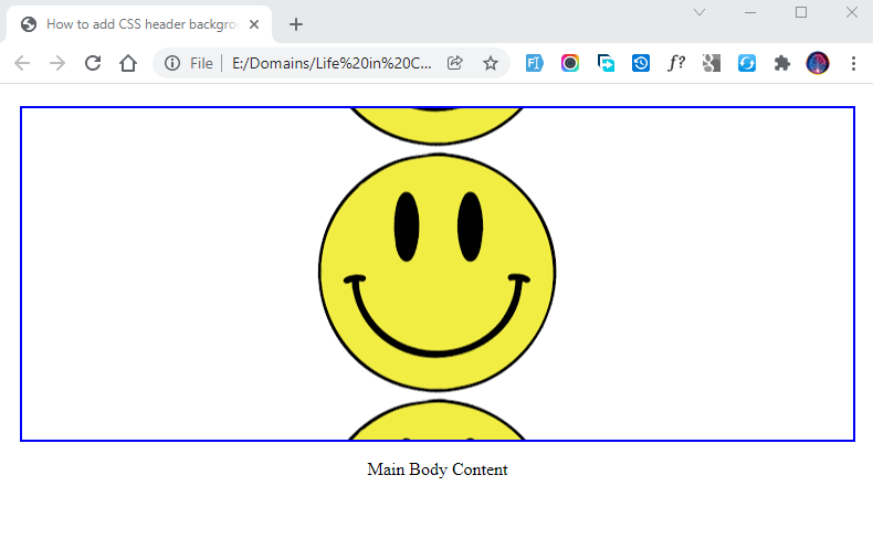
Using repeat-y will repeat the picture in a vertical pattern. The smiling picture is repeated in the vertical pattern in the above image.
Background-repeat: space
CSS :-
    .header-image {
        background-position: space;
    }
Result :-
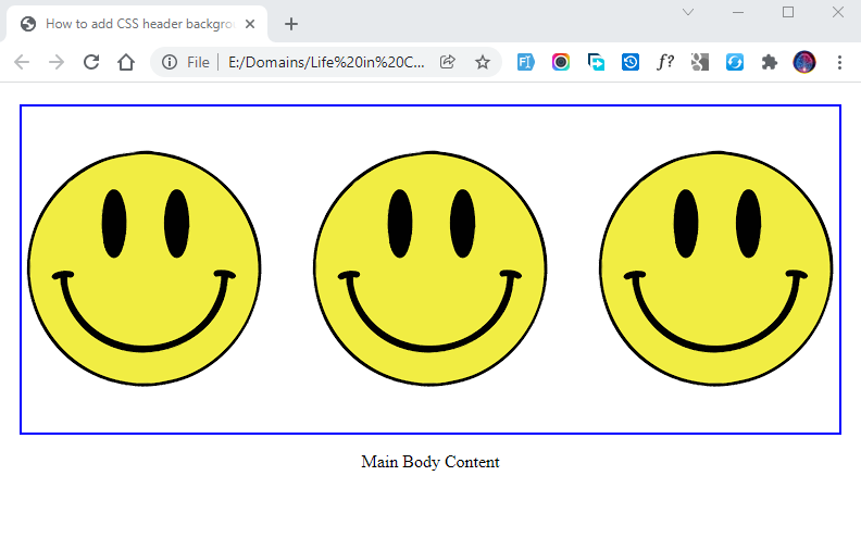
This property value is used to display the repeated image in properly manner. As you can see in the very first example, the smiling picture is repeated & it is cutting in the sides of the container.
Using this value will display the smiling picture without cutting it from sides & it will adjust the space evenly.
In the above image, we can see the images are displayed very neatly with proper space.
Background-repeat: round
CSS :-
    .header-image {
        background-position: round;
    }
Result :-
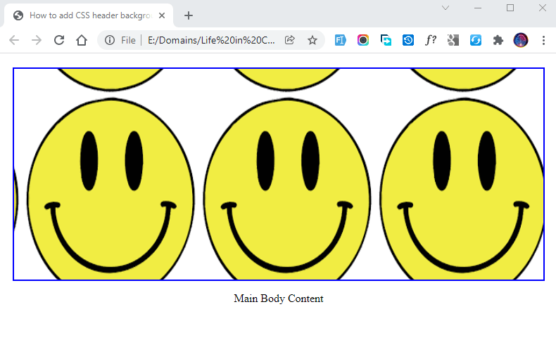
By applying Round value the images will stretch or shrink slightly to avoid clipping and to produce no gaps.