CSS
How to make CSS Font Size Responsive
In this post, we will show you how to create responsive font size text using CSS. There are multiple ways to make the font size of the text responsive. To keep the things simple, we will focus on the simplest methods that can be applied instantly.
Contents
Responsiveness is the need of the century because everything is growing & expanding. Millions of people browse the websites designed by the web designers from different devices. Number of Devices are increasing & they all have different sizes, when the web site is not capable to stand still in every device then it has no impact on the Users.
Responsive font size means the text within the web page should follow the browser size. The size of the font increases or decreases in coordination with the size of the browser.
When we apply font size to any text then the size remains constant in every device. To make it dynamic we have to write some extra CSS that will make the font size responsive.
Before diving in the practical solution, we can take a look at some details about the font-size property.
Font Size Property
With the help of CSS, We can set the size of the font by applying font-size property. The Numeric or Keyword value is set to this property that determines the size of font. Bigger the number the larger the font size.
Use of the font size is the nothing but the matter of choice & it depends on the nature of the web site that is designed. Normally the headings are given a little extra font size than the content following the heading. When something important has to be highlighted then we can make that particular section of text bigger in size.
Applying the font sizes can be categorized in 4 different sections. And we can apply any 1 category unit at a time for particular html element.
Below section cover these 4 sections & as you have knowledge about them then you can apply them with ease. Knowing the information is the key to mastery. When we have no information then there is no scope of using it.
Below section includes the ways to apply font size values.
Font Size with Keywords
In this category, we apply font size with the help of the keywords. The keywords are pre-defined in the framework & we need to pick the keyword that suits our requirement.
Using the keyword to apply font size is the simplest & here we provide the font size with clear to understand words. The font-size property then receives the instruction & renders the text with the provided size.
Let’s see the list of options that we have to use as keywords.
| medium | This is the default value of font size property. This value will set the size of the font to medium size. This is the balance size between small & large. |
| xx-small | This value will set the text to smaller in size & this is the smallest size available in this category. |
| x-small | This value will set the text to extra smaller in size & this size is little bigger than the first one. |
| small | This value will set the element’s text to normal small size. |
| large | This value will set the text size to be large in size. |
| x-large | This value will set the text size to be extra large in size. |
| xx-large | This value will set the text size to be xx large in size. This size is larger than x-large. |
| smaller | When this value is set then it will check the parent element & apply smaller size to the current element. |
| larger | When this value is set then it will check the parent element & apply larger size to the current element. |
Font Size with Pixels & EM
Within this type, we can apply font size by specifying the numeric positive value following the unit type. First we choose the number for the font size then we include the unit type like pxs or em. Every unit type renders sizes in different ways.
The size specified in one unit type will be different from another unit type. For example, if we apply 14px & 14em then there is going to be the difference in the font sizes.
Pixels
This is one of the exact unit types that renders the precise size of the text. You provide the pixel & same is applied on the screen. There are a lot of different devices to open the web application & pixels are relative to the device that the user is using.
Example
        div { font-size: 18px; }
        h1  { font-size: 25px; }
EM
EM’s are the ones that auto calculates & sets the size of the text based on the parent elements. When you have a parent element that is set a size of 16px & child element is set the value of 2em this means child element will be two times bigger than parent because we have set 2em (16px*2 = 32px).
What if the parent element has no font size set? Then the default value will be considered for the parent element. The default value provided in the pre-built framework is 16px.
Example
        div { font-size: 1em; } // 16px
        h1  { font-size: 1.5em; } // 24px
CSS Font Size Responsive with Viewport unit
To make the font size responsive using CSS, a viewport unit is the first way to achieve responsiveness. When this unit is set then the size of the text will be dynamic & it will adjust as per the browser window. Vw is used for setting this value which means viewport width. This unit type is calculated based on percentage of the browser width.
CSS :-
        p {
            font-size: 4vw;
        }

        div {
            font-size: 16px;
        }
HTML :-
        <p>
            I Posses Dynamicness.
        </p>

        <div>
            I am not Dynamic.
        </div>
Result :-
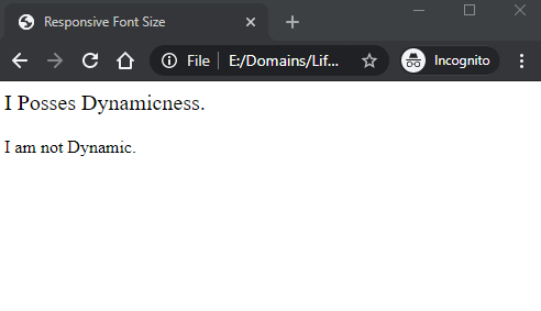
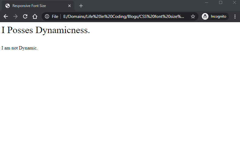
As you can see in the Images that the first line which is <p> tag increases in size because it has vw applied to it. And second line remains static because it has px applied to it.
CSS Font Size Responsive using Media Queries
We can also control the font size with the tool of media queries. Media queries apply the CSS based on the screen size. It checks for the screen size & then applies the values that match the screen size provided in CSS.
In the below example code, when the screen size is detected as 320px or less then the style specified within the block will be applied. If screen size is more than 320px then default style for this element will be applied.
        @media screen and (max-width: 320px) {
            div {
            font-size: 22px;
            }
        }
In the below example code, when the minimum screen size is 321px or more then the style specified within the block will be applied.
        @media screen and (min-width: 321px) {
            div {
            font-size: 32px;
            }
        }
Conclusion
As you have learnt now by reading the practical steps to make font size responsive using CSS, it’s time to practice the code so that you can experiment on our own.
CSS is the tool that is uncomplicated & fun to apply, if you learn & have proper information about it then designing a web application becomes an exciting process.
Happy Web Development 🙂
