
CSS
CSS Class Hover

This blog will demonstrate the use of hover effect in CSS on various elements on an html page. To understand the Hover effect we have to first understand the word Hover. Hover means when we move our mouse cursor to an element on a web page. If the programmer has programmed an hover effect then that element will change its appearance.
We will learn how to bring a hover effect on the elements with the help of classes applied on various elements like div, a & button elements.
CSS – Div class hover
Hover effect can be directly given to the elements but when it is applied to a particular element like div then the hover effect will be reflected to all the div elements.
Using a class to apply the hover effect, gives us a choice to apply it on selective elements. We need to just add the class name to the element to apply the effect.
Hover effect is basically used to highlight the element by changing its appearance & it also gives the user a confirmation that he is positioned to that particular element.
To demonstrate with an example, we will look into the div tag & apply the hover effect with the help of class.
CSS :-
    div {
        padding: 25px;
        margin: 25px;
        border: 2px dashed blue;
        font-size: 40px;
    }

    div.hoverDivs:hover {
        background-color: red;
        color: white;
        font-style: italic;
    }
HTML :-
    <div class="hoverDivs">
        I am Hover Div.
    </div>

    <div>
        I am Non Hover Div.
    </div>
Result :-
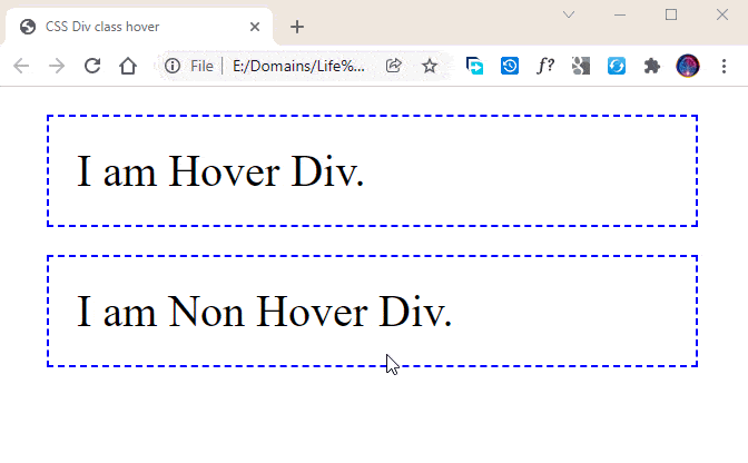
In the CSS section, in the second style we have defined a hover effect that will be applied on div tags having class name as hoverdivs.
div.hoverDivs is concerned with the selection of elements.
:hover is used to apply the hover effect.
On hover effect, we are changing the background color of the div to red & text color to white. We are also changing the style of the text to italics.
The HTML section has 2 divs. Last one is without any class & the first one is given the class name of hoverDivs.
In the result image, we can see that only the first div element is receiving the hover effect. And the second div remains unaffected because we have applied hover effect to only specified class name.
CSS – Anchor class hover
Anchor tags are used to navigate the user to some other page or to some other region in the same page. Another page can be of the same website or it may be of some external website.
Anchor tags are important because we are inviting the user to check out some other content. For the user to know the link is clickable, we apply the hover effect so that the user can understand that the link is clickable & it is not just plain text.
When a new website is designed, the anchor tags are styled with colors matching with the theme. And the same classes of anchor are used across all the pages.
Using the classes for anchor tags also gives a choice to design multiple anchor hover designs & apply them as per the design of a particular region of the page. For example, links used in the footer section can be given different styles & the links in the Navigation bars can be given different styles.
Following is a simple demonstration for the use of Anchor hovers with the help of class.
CSS :-
    a {
        padding: 25px;
        font-size: 40px;
    }

    a.anchorHover:hover {
        background-color: red;
        color: white;
        font-style: italic;
    }
HTML :-
    <a href="#">I am Anchor Tag with Default Style.</a>
    <br />
    <a href="#" class="anchorHover">I am Anchor Tag with Hover Effect.</a>
Result :-
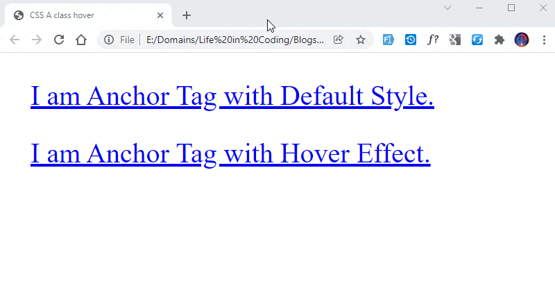
CSS section defines hover effect to the anchor class & the effect will be applied only to the anchor with class name & all other anchor elements will work as per their default behavior.
When a user hovers over the link, we are changing the background & text color of the link. Also the styling is displayed in italics. We can apply many other styles & you can give it a try by using some other styles.
We have mentioned the class name anchorHover & applied the styling only to this class. If we remove this class from the CSS section then the hover effect will be applied to all anchor tags.
In the HTML section, we have 2 anchor tags, first one is without class & second one is with class anchorHover. The one without class displays without any hover effect & the second one functions with the given hover effect defined in CSS.
CSS – Button class hover
Button elements are usually used to accept some inputs from the user & they appear at the bottom of all the inputs. User submits the inputs by clicking on the button.
We can see colored buttons in different websites & they enrich the design of the application. The hover effect on the buttons adds an extra layer of enhanced design.
The hover is applied to the button in the same manner as demonstrated in the above examples. Only the elements & classes are replaced before the :hover syntax.
Let’s take a look at the code demonstrating the button hover effect with different colors through CSS.
CSS :-
    button {
        padding: 25px;
        margin: 25px;
        font-size: 40px;
    }

    button.redStyle:hover {
        background-color: red;
        color: white;
    }
    button.blueStyle:hover {
        background-color: blue;
        color: white;
    }
    button.greenStyle:hover {
        background-color: green;
        color: white;
    }
    button.purpleStyle:hover {
        background-color: purple;
        color: white;
    }
HTML :-
    <button type="button" class="redStyle">Submit</button>
    <button type="button" class="blueStyle">Submit</button>
    <button type="button" class="greenStyle">Submit</button>
    <button type="button" class="purpleStyle">Submit</button>
Result :-
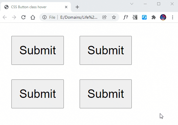
We are defining 4 different classes with different colors in the CSS part of the code. For the purpose of understanding, we have used the same hover effect with different colors.
The first style in CSS is the button style providing normal styling to the buttons like font-size, padding & margins.
The reset of the styles are the hover effects on the buttons with different colors. Any of these classes can be used to apply the hover effect that will change the appearance of the button on hover.
HTML code is populated with 4 buttons having 4 different classes. Each button has been given a different hover effect with the use of classes defined in CSS.
We can see in the Image how the button changes its color on hover. Each button displays a different color because of the particular styles given to it.