In this blog post, we will learn How to add rounded corners to a button with the help of CSS. Buttons can be given a dynamic look by using the available styles so that the user experience can improve. The plain buttons look outdated & they are replaced by a new design of rounded corners.
Rounded corners HTML Buttons
The default buttons are displayed in a rectangle format. They have sharp edges around four corners. These edges can be molded easily for enhancing the button design.
border-radius property is used for shaping the corners of the button from sharp to round. By default the radius is 0 & we can increase it to add the rounded effect to the button.
We can apply these styling of rounded corners to all the buttons by create a class style for the same & then applying the class to all the buttons.
Let’s see an working example to understand it practically :-
CSS :-
    .style1 {
        padding: 20px 40px;
        margin: 25px;
        color: #fff;
        font-size: 25px;
    }

    button.red {
        background-color: red;
        border-radius: 10px;
    }

    button.green {
        background-color: green;
        border-radius: 10px;
    }

    button.cyan {
        background-color: cyan;
        border-radius: 10px;
    }

    button.purple {
        background-color: purple;
        border-radius: 10px;
    }
HTML :-
    <button class="red style1">Button</button>
    <button class="green style1">Button</button>
    <button class="cyan style1">Button</button>
    <button class="purple style1">Button</button>
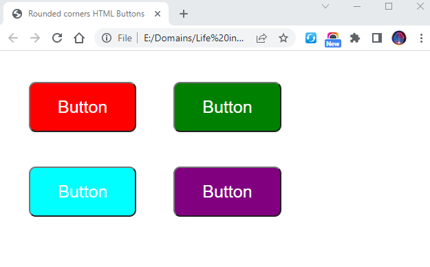
Result :-

Within CSS section, we have created different class styles with different colors for the buttons.
All the styles are given the border-radius as 10px. This property will make the button corners to shape in rounded form. The more pixels applied, the more rounded the corners will be.
In the HTML part, we have created 4 different buttons giving them classes of unique colors. The result image displays all the 4 buttons with rounded corners.