CSS
How to disable button with CSS
In this blog post, we will look into “How to disable button with CSS” on a webpage & get into various ascpects relating to it.
Contents
How to disable button with CSS?
Buttons are placed on a webpage to perform some event. When the user clicks it then something happens on that page as per the coded actions by the programmer.
There are certain scenarios that we want to show the button but it will only be clickable after a certain condition is fulfilled. Example is the Login page, we want the user to enter the username & password then he can click the login button to enter within the application. When the details are not yet entered by the user then clicking the button is of no use so it can be kept disabled.
After disabling the button, it will stop performing any action & as a default style it will be grayed out. When the user clicks it, the main event will not be performed.
Disabled buttons can also be styled with the help of CSS styles. We can also change the cursor when the user hovers over the button so that the user can easily understand that the button is disabled.
Let’s walk through the code to disable button with CSS :-
HTML :-
    <div>
        <button>I am not Disabled</button>
        <button disabled>I am Disabled</button>
    </div>
Result :-
How to style disabled button with CSS?
It is necessary to style a disabled button in a proper manner so that user can understand it is disabled. If user is unable to understand he will keep clicking the button & will think there something wrong in this website.
Usually the disabled button can be shown as grayed out with a cursor value of not allowed. Different variations of grayed color can be applied as per the preference.
The title text also helps in giving quick information to the user. Title text appears automatically when the user hovers over the button.
The style of the disabled button should be different from the style of the normal buttons. So there can be 2 different set of styles defined in CSS for normal button & disabled button.
Below code is used for styling the disabled buttons :-
CSS :-
    button:disabled,
    button[disabled] {
        border: 1px solid #999999;
        background-color: darkgrey;
        color: #fff;
        padding: 10px;
        cursor: not-allowed;
    }

    .btn {
        border: 1px solid #999999;
        background-color: blue;
        color: #fff;
        padding: 10px;
    }
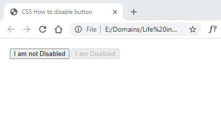
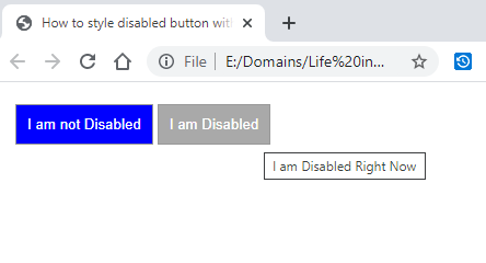
HTML :-
    <div>
        <button class="btn">I am not Disabled</button>
        <button disabled title="I am Disabled Right Now">I am Disabled</button>
    </div>
Result :-
How to disable hover effect when button is disabled CSS?
When the button hover effect is defined in styles then it gets applied to all the buttons. The button may be enabled or disabled the same style applies to both with no difference.
We can modify this default behavior & apply the style only to the enabled buttons on a web page. For the disabled buttons this style of hover effect will not be applied.
Changing the hover effect is necessary for disabled buttons because the users always hover the buttons before clicking it. If the hover effect for disabled button is the same as the enabled button then there will be no difference & disabled button might look like an enabled button.
The style for the disabled button is usually faint. So the hover effect can also be styled to the same pattern to maintain consistency.
Below code displays the style that can disable hover effect of button :-
CSS :-
    .btn {
        border: 1px solid #999999;
        background-color: blue;
        color: #fff;
        padding: 10px;
    }

    .btn:hover:enabled {
        background-color: black;
        color: #fff;
    }

    button:disabled,
    button[disabled] {
        border: 1px solid #999999;
        background-color: darkgrey;
        color: #fff;
        padding: 10px;
        cursor: not-allowed;
    }
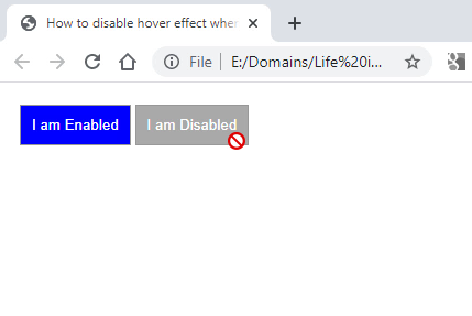
HTML :-
    <div>
        <button class="btn">I am Enabled</button>
        <button class="btn" disabled>I am Disabled</button>
    </div>
Result :-